Utenos Radler rebrand
From low shelf visibility and printing issues to show stopping design
About the project
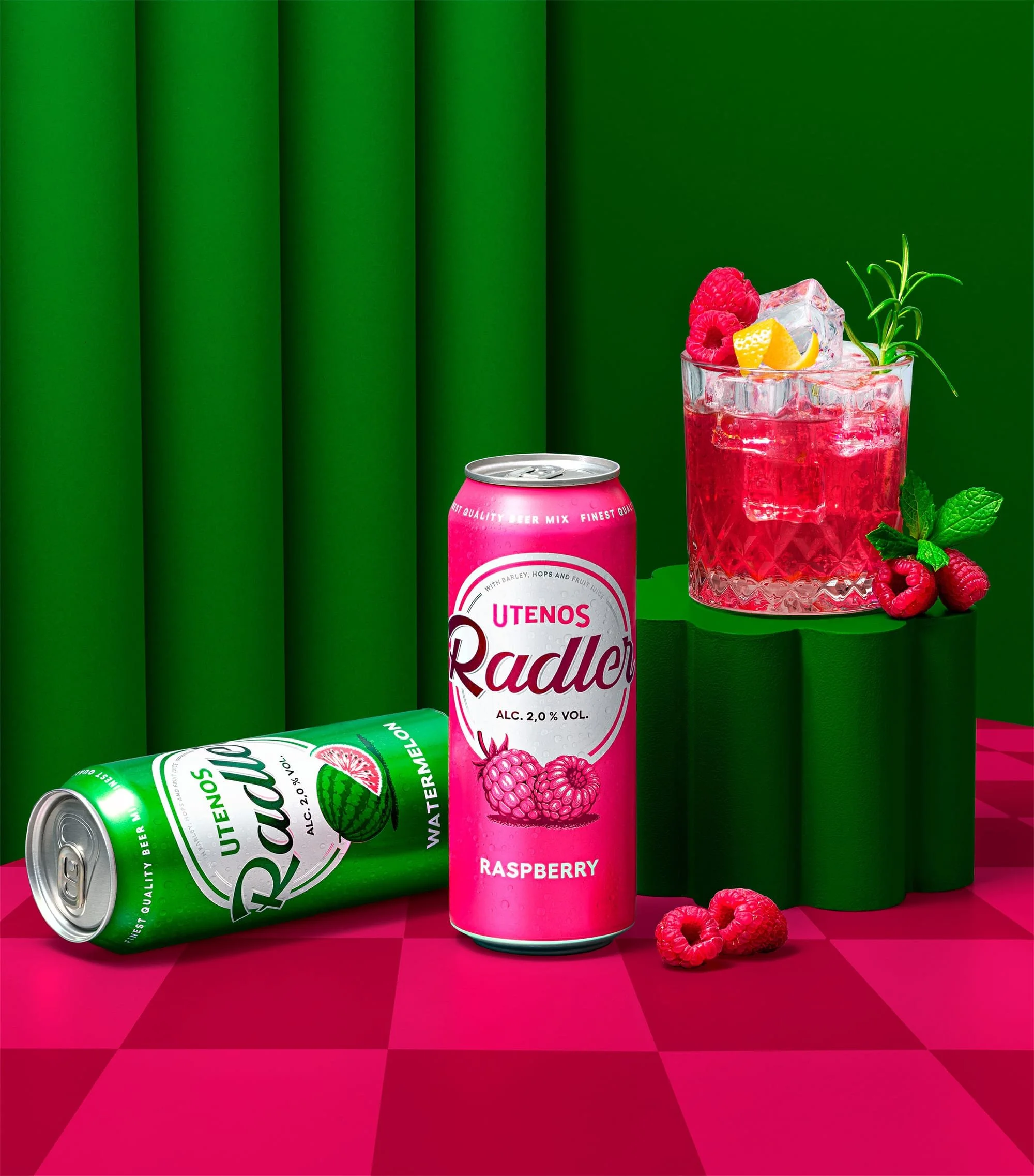
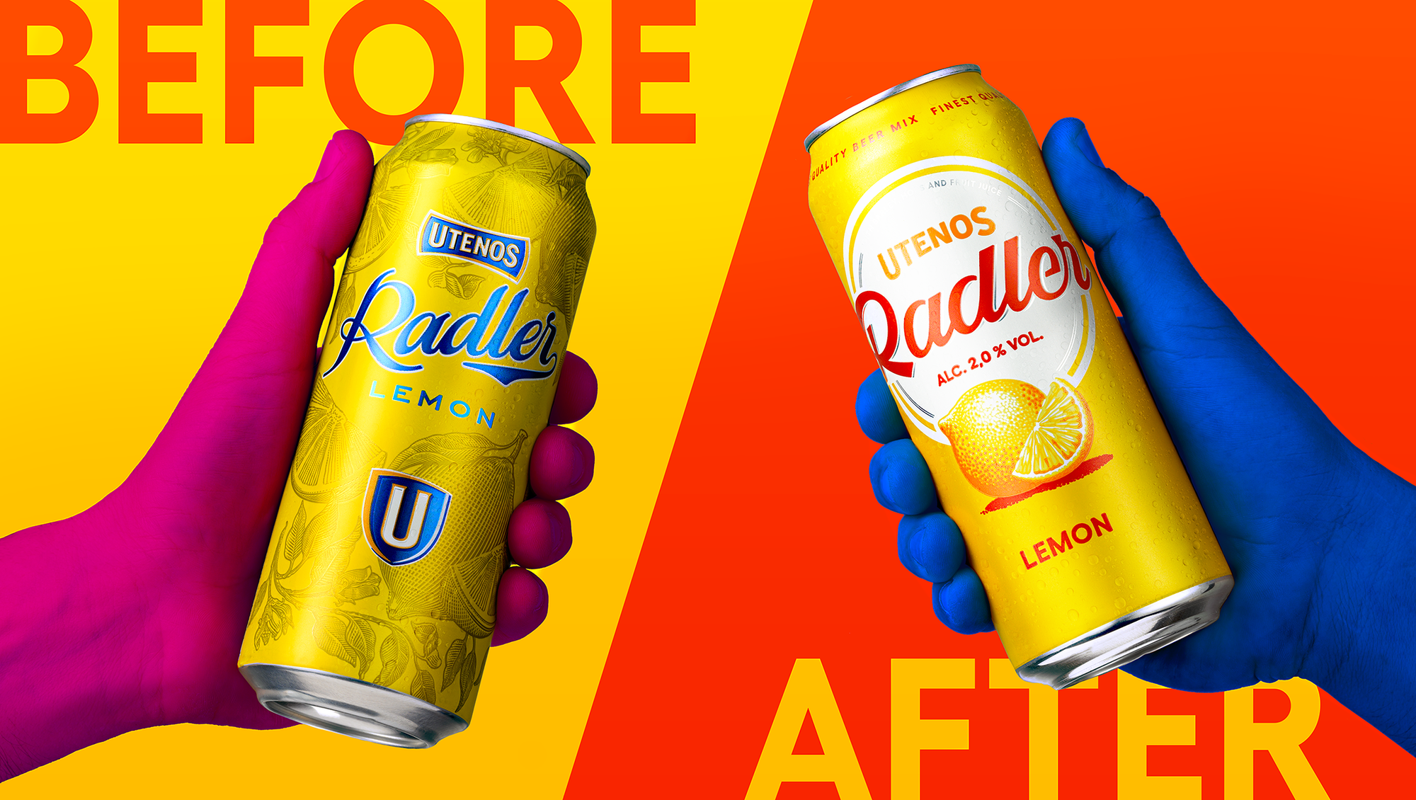
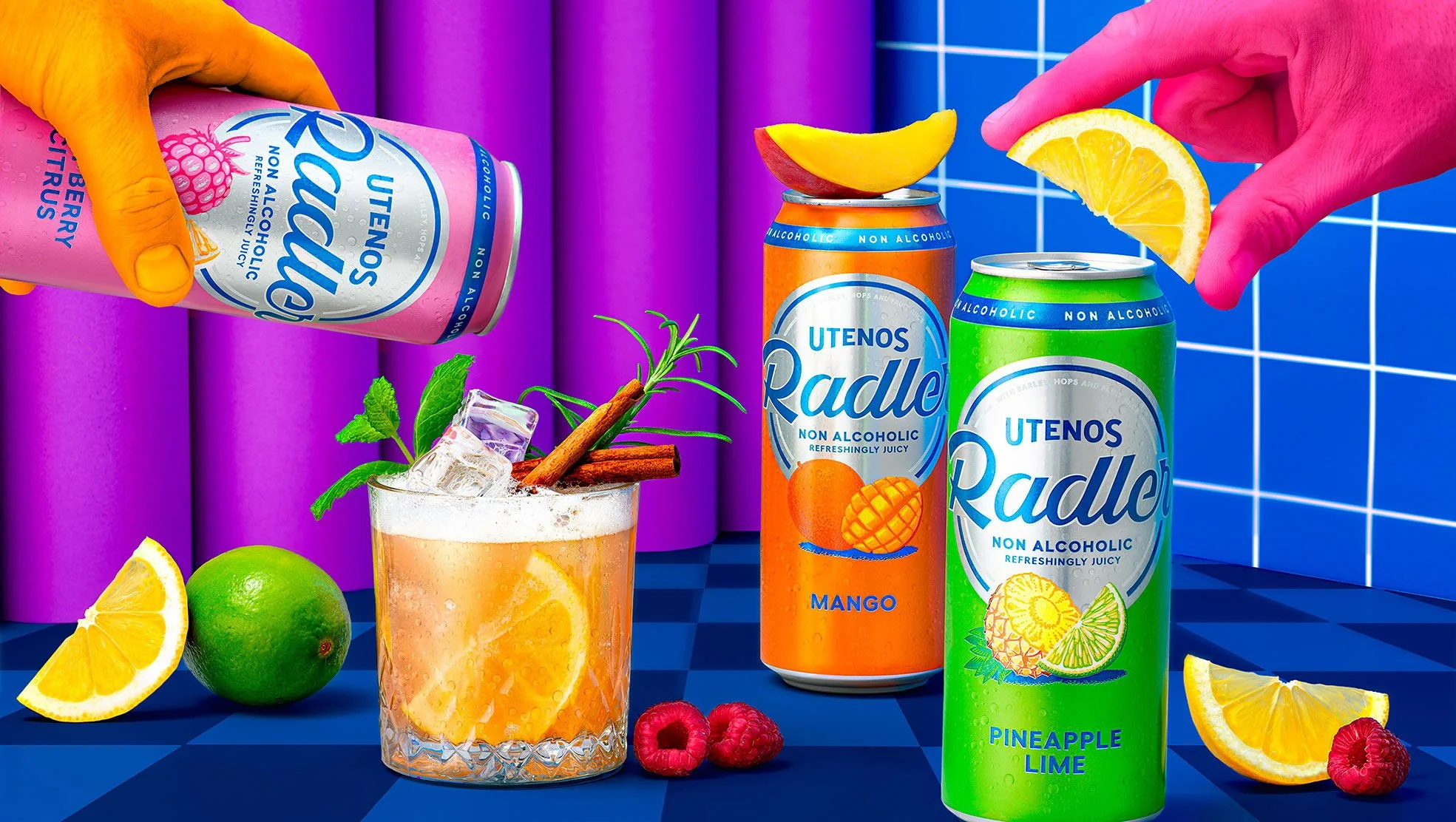
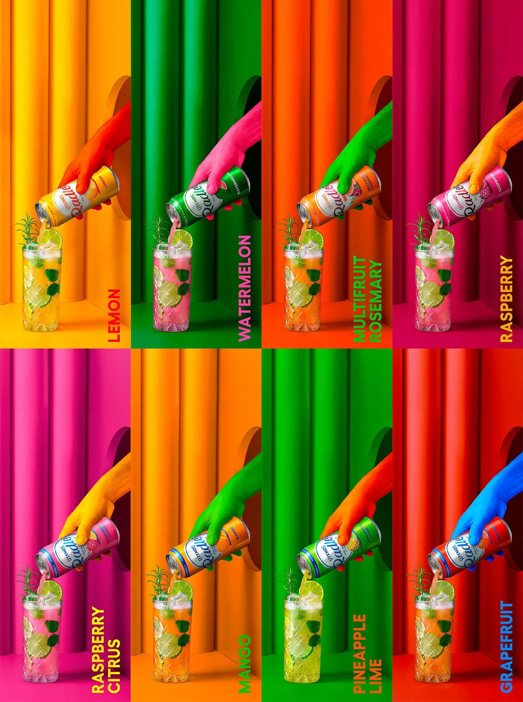
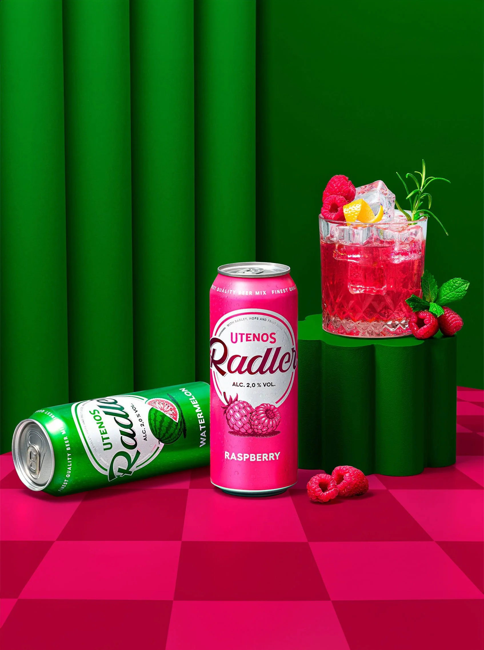
Utenos Radler aimed to fix two packaging issues: low shelf visibility and printing problems on aluminum cans. The goal was a clear, neat colour block easy to read and visually cohesive.
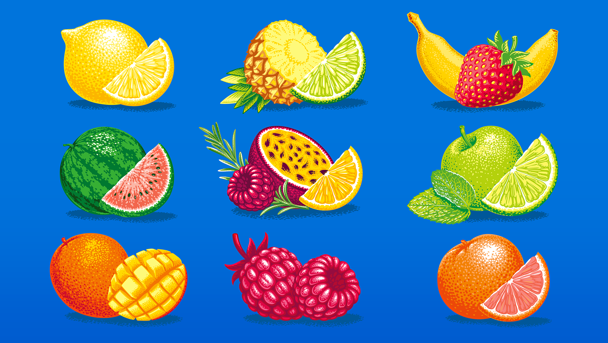
To overcome print limitations, we used vector illustrations in primary colours with a dot technique to mask natural pigment dots.
Credits:
Client: Švyturys-Utenos beer
Agency: étiquette
Art direction: Irmantas Savulionis
Design: Beatričė Baronaitė Lau
Prepress designer: Beatričė Baronaitė Lau
Account management: Ramunė Slepovė
Illustrations: Olexa Andryuschenko
Photoshoot: étiquette photo studio
Photoshoot concept & Art direction: Beatričė Baronaitė Lau
Photographer: Irmantas Savulionis
Photoshoot postproduction: Beatričė Baronaitė Lau