Utenos Radler new look & feel
25/04/2024
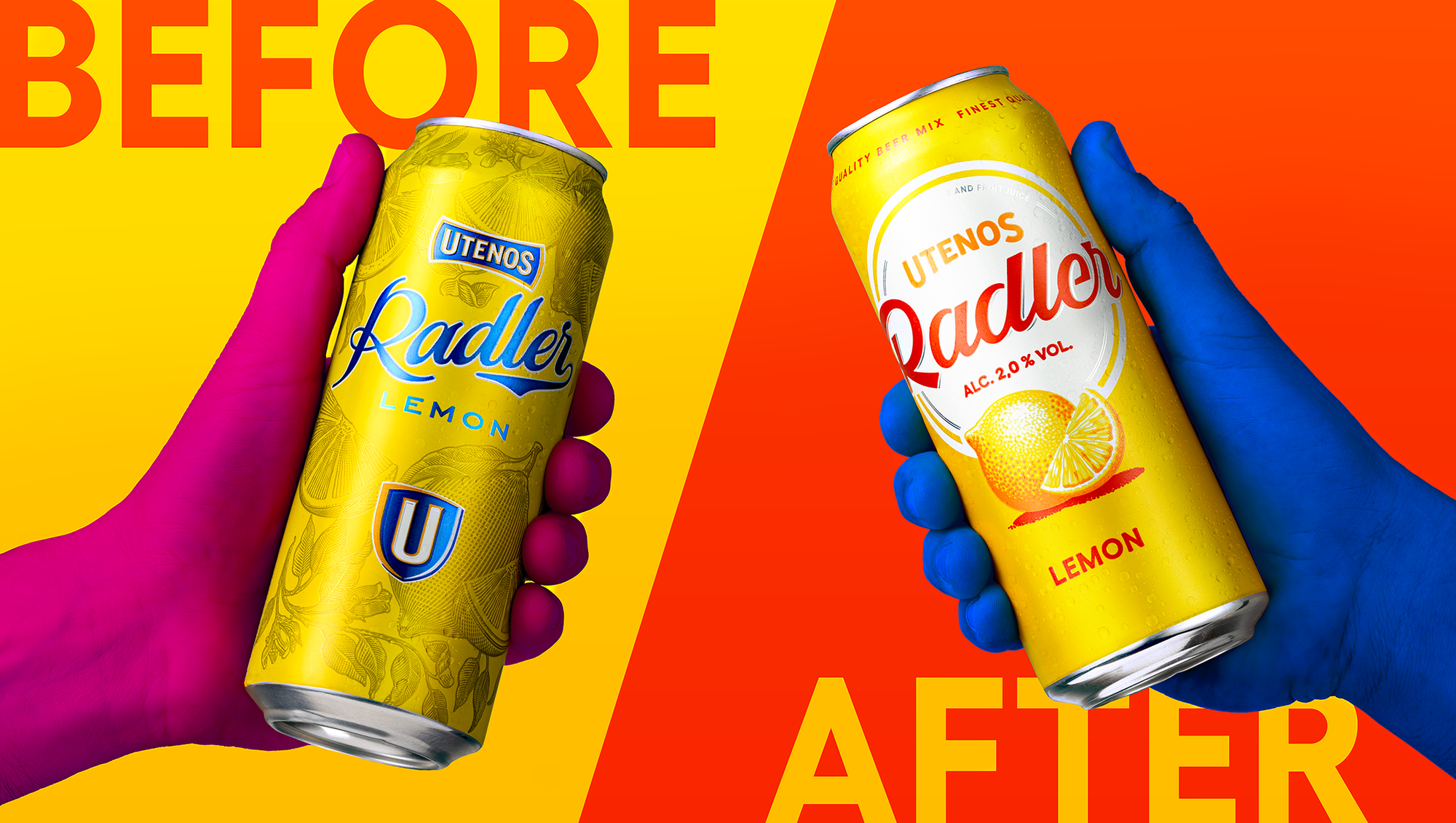
Situation
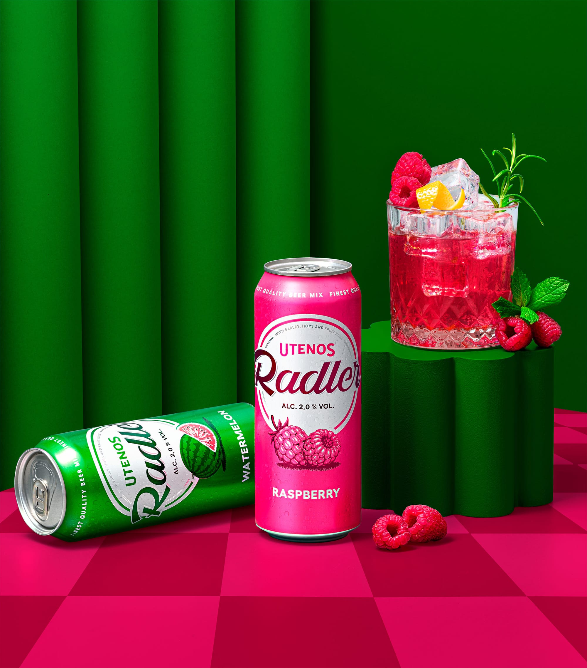
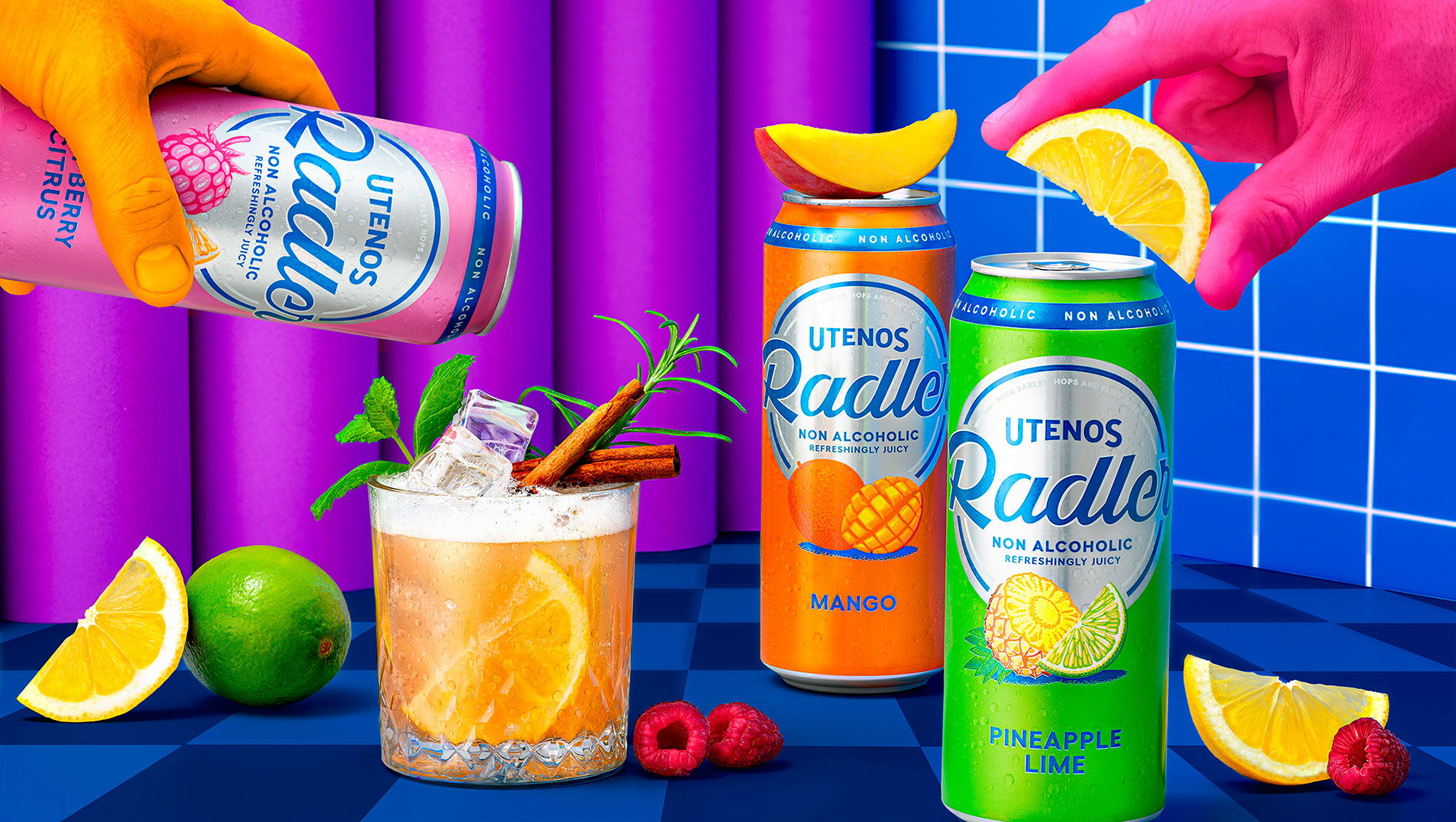
Utenos Radler came to us looking to solve two of their main issues with their current packaging: 1) poor visibility on the shelves and 2) technical problems with printing on aluminium cans.
Logo evolution and typography
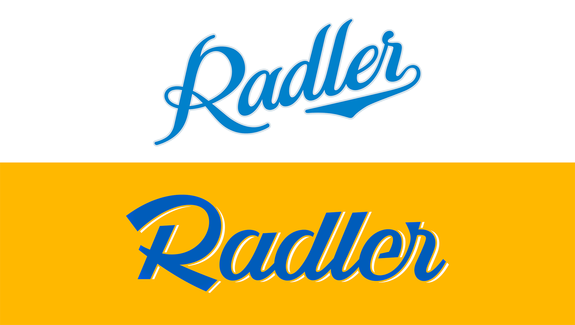
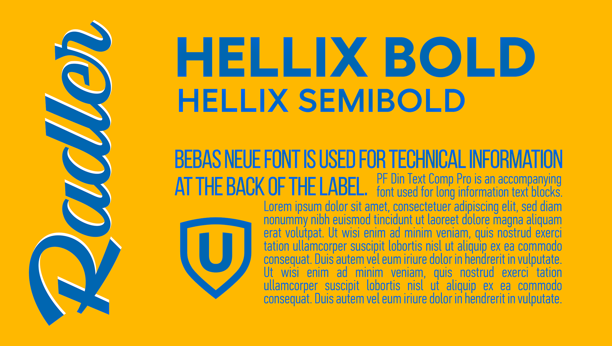
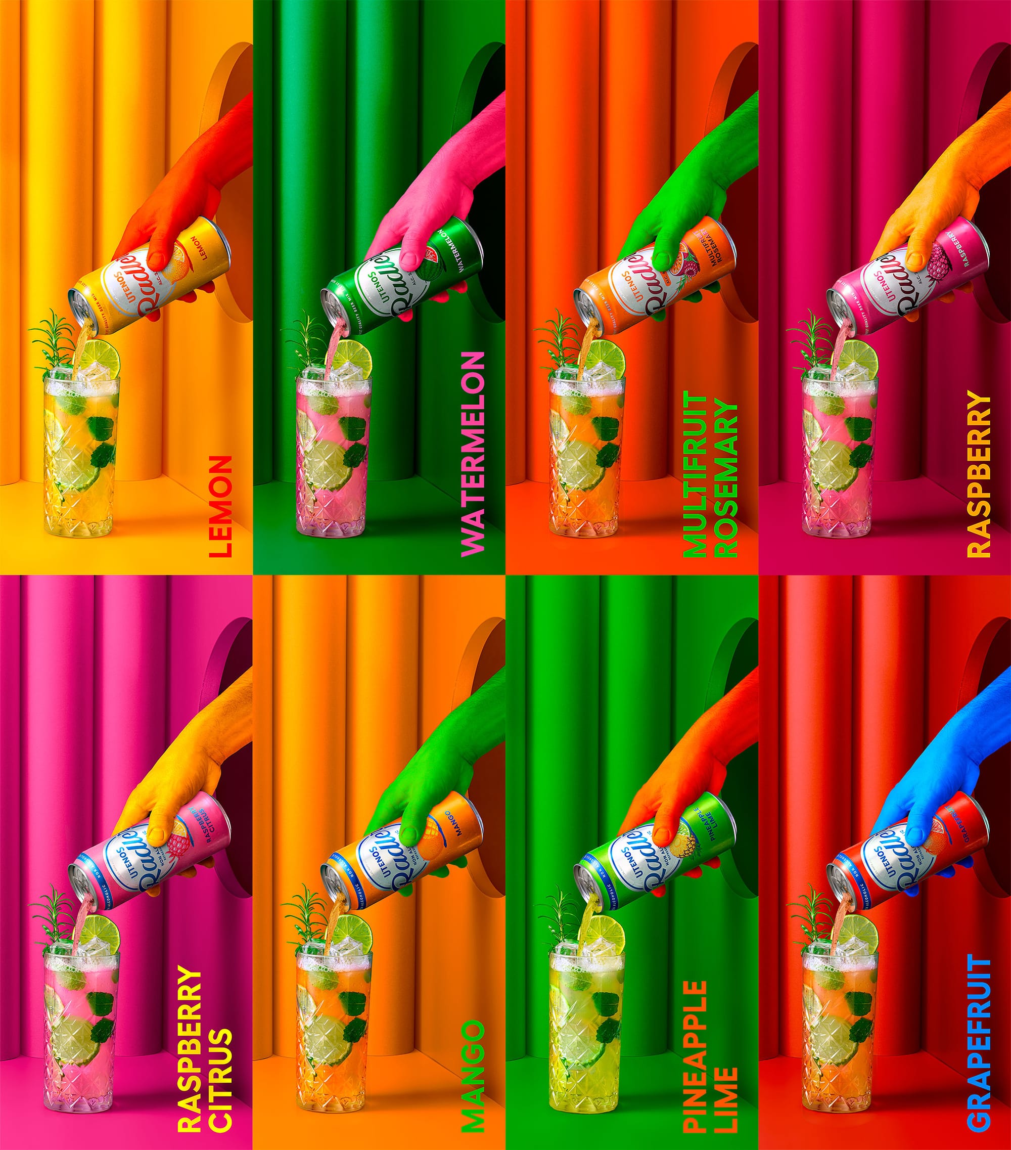
For higher visibility on the shelves, we placed the logo in a white (or silver for non-alcoholic SKUs) round shield. Modernised the old-fashioned script typography and used clean-cut lines while leaving the accent on the R. The text block was another challenge as the area was exceptionally small. The goal was to create a neat block that was easy to read for the average consumer and still make it look presentable and cohesive with the rest of the can.
Illustrations
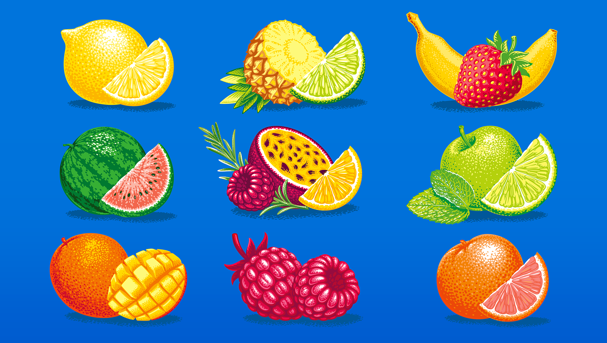
Knowing the technical print limitations we decided to go with vector-based illustrations in primary colours, using a dot technique that would mask the naturally occurring pigment dots in the printing process.
Multiple SKUs
As Utenos Radler always comes out with new flavours, so it was important to create a set of visual elements that could easily be adapted to a new SKU, while remaining cohesive with the core range.
Credits
Client: Švyturys-Utenos beer Agency: étiquette Art direction: Irmantas Savulionis Design: Beatričė Baronaitė Lau Prepress designer: Beatričė Baronaitė Lau Account management: Ramunė Slepovė Illustrations: Olexa Andryuschenko Photoshoot: étiquette photo studio Photosoot concept & Art direction: Beatričė Baronaitė Lau Photographer: Irmantas Savulionis Photoshoot postproduction: Beatričė Baronaitė Lau